
From the data to the story: A typical ddj workflow in R
This tutorial will guide you through the standard steps of the data journaling workflow in the R programming language using a simple example.

For this exemplary data journalism R workflow, we’ll have a look at data from BBSR Germany. As always, you’ll find the data and the (less well-commented) code on our GitHub page. This time, the R script is organized as an R Project, which makes collaboration easier because the working directory is automatically set to the directory where the Rproj file is located. A double click on the Rproj file opens a new RStudio Window that is already set to the right working directory of the analysis. Then you can open the R script as usual.
Note: R has a great selection of basic functions to get you going. And because it’s open source, there are plenty of great packages with additional functions. I’d really like to recommend to you these five packages, which we’ll also use in this tutorial:
needs: needs is a helpful function which makes package installation and loading as easy as possible. Once you’ve installed and loaded it, needs will ask you whether it may load itself when it’s – well – needed. Once you’ve said yes to this great function, you won’t need to install or load any package step by step ever again. Just list all your needed packages in needs(), and it will only install and/or load the packages that aren’t installed and loaded yet.
# R
# example:
install.packages("needs")
library(needs)
needs(readxl, tidyr, dplyr, ggplot2)
readxl: I don’t know about you, but I mostly get my data in multipage Excel worksheets, then convert it to CSV because text editors and programming languages work better with this format. But loading CSVs into R can be a real pain when it comes to chaotic use of quotations, different separators or characters that contains german umlauts, french apostrophes or other language quirks. And converting an Excel document with more than one sheet to CSVs is one step more than I want to do in the morning. readxl offers the great function read_excel(), that can easily load data from Excel worksheets.
# R
#example:
data <- read_excel("data.xlsx", sheet=4)
#or
data <- read_excel("data.xlsx", sheet="sheet name")
I like my data tidy and easy to handle. The next three packages will help you tidy up your data, manipulate it (in a positive way) and visualize your results.
tidyr: tidyr melts your data into the tidyverse as described by creator Hadley Wickham: "Each variable is a column, each observation is a row, and each type of observational unit is a table. This framework makes it easy to tidy messy datasets because only a small set of tools are needed to deal with a wide range of un-tidy datasets."
With gather(), you can get your data from a wide format with every variable as a column into a long format where one column contains the variable’s names and another column contains the matching values. This format may seem more difficult to manually get an overview, but it works like a charm when used with the functions from the two following packages.
dplyr: dplyr is great for applying functions to parts of your data. It helps you filter, group and summarize your data. We’ll get to know some of the functions later in this examplary workflow. Though dplyr comes with the depending package magrittr we need to connect the functions, sometimes you have to install and load magrittr additionally to make sure everything works.
ggplot2: ggplot2 is the beauty among R’s graphic packages. Kind of like dplyr, ggplot2 lets you chain its graphic functions one by one, making it super comfortable to work with. Ggplot2 produces awesome, high quality visuals.
I always subdivide my R scripts into three parts:
Head: The part where I load packages and data
Preprocessing: The part where I clean and, well, preprocess the data for analysis
Analysis: The part where I analyze the data
The three parts don’t necessarily have to be in the same script. To make the analysis cleaner, you could save the head and preprocessing in a separate R-file that can either be sourced in the beginning of the analysis script or have the preprocessed data saved as a new data source that can be loaded in the analysis script.
Head
Enough talk! Let’s start with loading the packages we need for our analysis.
# R
#install.packages("needs")
#library(needs)
needs(readxl,tidyr,dplyr,ggplot2,magrittr)
Next, we need to load the data. For this example, I prepared an Excel Worksheet with two data sheets. Both contain data on Germany’s 402 city districts. We have the unique district ID and the district name as well as information on whether the district is a county or a city district. The first Excel sheet contains the average age of the district’s male population, the second contains the same data for the female population.
Note: These statistics are based on the update of census data from Germany. Only the genders "male" and "female" are recorded in it.
# R
# Load the two data sheets into two different data variables:
# Example if your data is in a CSV: file <- read.csv("file.csv", sep=",", dec=";", fileEncoding="latin1", na.strings="#")
age_male <- read_excel("age_data.xlsx", sheet=1)
age_female <- read_excel("age_data.xlsx", sheet=2)
Preprocessing
Now that we have the data, we have to do a little preprocessing. We want to merge both dataframes into one that contains the age of the male and female population for each district. Let’s have a look at the frames to check whether we can do the merge:
# R
head(age_male) # check the first rows of the male age data
head(age_female) # check the first rows of the female age data
# check the number of rows
nrow(age_male)
nrow(age_female)
We have two findings:
- The dataframes aren’t sorted in the same way and the column names aren’t the same either. Luckily, the order isn’t important for the merge. We’ll get there later.
- age_female has more rows than age_male and more rows than there are german districts. What’s the reason for this?
Maybe there are duplicated rows:
# R
any(duplicated(age_female)) # check for duplicates in age_female
age_female <- unique(age_female) # delete duplicates
nrow(age_female) # check rownumber again
Great, we just had to remove some duplicated rows. Now, let’s merge the dataframes! If they were ordered in exactly the same way, we could use the function cbind() to simply add the age column of age_female to age_male. But because the order isn’t the same, we have to use merge(). merge() joins dataframes according to a column containing unique values that both have in common. For our example, the unique district ID seems to be the best choice. Because we just want to add the age column of age_female and not all its columns, we only select its first and fourth column by indexing age_female[c(1,4)]. Then we have to tell merge() the name of the matching column with the parameters by.x for the first and by.y for the second dataframe. If the matching columns had the same name, we could just use the parameter by.
# R
# merging
age_data <- merge(age_male, age_female[c(1,4)], by.x="district_id", by.y="dist_id")
head(age_data) # looks good!
P.S.: Merging also works with data frames of different lengths. In that case, you can specify whether you want to keep unmatchable rows. Type ?merge into the R console for more information.
Now for the tidyverse: We want the columns average_age_males and average_age_females to be converted into one column containing the variables name and one containing the matching values. With the parameter key, we tell gather() what the new column with the attribute names should be called. We give value the new column name for the values and then specify the columns that should be gathered by applying the columns’ indexes.
# R
# tidyverse
age_data <- gather(age_data, key=key, value=age, 4:5)
head(age_data) # that's what I call tidy!
By the way: 1:3 is just the same as c(1,2,3).
Analysis
As mentioned before, a very nice package that’s great for getting a first overview of your data is dplyr. Like tidyr, it’s a package by Hadley Wickham and designed to work well with the tidy data format.
Helpful dplyr function we'll use in the following steps
%>% and %<>%
These are the magrittr pipe -operator and the compound assignment pipe -operator. The pipes connect functions to a chain of functions. Each function works with the result of the previous chain link. The assignment pipe can be used to directly assign the result of the chained functions.
# example: mean(x) is the same as x %>% mean() and x %<>% mean() overwrites the variable x with the result of mean(x)
summarize()
The summarize function summarizes a data frame using a calculation the user specifies.
# example: data %>% summarize(result=sum(column1, column2))
group_by()
The group_by function can be used to apply a function to different groups of the dataframe
# example: data %>% group_by(country) %>% summarize(sum=sum(city_income)) (resulting dataframe will contain one value for each individual factor in the column "country")
filter()
This function will filter the rows according to a given condition
# example: data %>% filter(column1 %in% c(1,10))
mutate()
mutate won’t summarize the entire dataframe like summarize does, but add the result as a new column
# example: data %>% group_by(country) %>% mutate(sum=sum(city_income)) (resulting dataframe will still contain every row of data)
arrange()
arrange will sort the dataframe in ascending order according to a column. For descending order, use desc() within arrange(). You can specify more than one column to sort by. Ties in the first column are broken by the next and so forth.
# example: data %>% arrange(desc(column1), column2)
select()
If you only want to retain specific columns in the resulting dataframe, use select to select or remove them
# example: data %>% select(1:3) or data %>% select(c(1,4)) or deselecting: data %>% select(-5)
Let’s get an overview of our data by filtering and summarizing the values:
# R
# Summarize the data to get the average age in Germany
age_data %>% summarize(mean=mean(age))
# Now group by the column key to get the average age for males and females in Germany
age_data %>% group_by(key) %>% summarize(mean=mean(age))
# In the same way, we can group by other columns, for example:
age_data %>% group_by(city_county) %>% summarize(mean=mean(age))

# Now calculate the average age per district. But instead of summarizing, save the result in a new column.
# This time, save the new dataset as a variable in the R environment
age2 <- age_data %>% group_by(district_id) %>% mutate(district_mean=mean(age))
head(age2)
# We now want to find the youngest cities of Germany.
# We won't need the columns key and age for that. We remove those columns and then reduce the dataset to the unique rows
age2 %<>% select(-c(4,5)) %>% unique()
head(age2)
# Now, use filter to only keep the cities, not the counties and arrange the dataset in descending order according to the district_mean
youngest_cities <- age2 %>% filter(city_county %in% "city") %>% arrange(district_mean)
head(youngest_cities)
# Next, we only want to have a look at bavarian cities, whose district IDs all start with "09". A great base function
# called startsWith() can easily find all district IDs that start with certain characters:
youngest_cities %>% filter(startsWith(district_id, "09"))
# Let's find the oldest bavarian city
youngest_cities %>% filter(startsWith(district_id, "09")) %>% arrange(desc(district_mean))
See how dplyr makes it really easy to have a look at different aspects of your data by just combining different functions?
You can even easily answer questions that seem a little bit more difficult at first, as long as you know your R functions. This is something that won’t be as simple with tools like Excel.
For example:
Let’s find the youngest city for every german state.
The states have unique IDs, represented by the first two numbers of the district ID. So we have to group the data by the first two numbers of district_id, then only select the row in each group with the minimum value in district_mean. To make this specific grouping possible, we need help from the base function substr(). To check out how it works, just type ?substr into your console.
Finally, arrange the data in ascending order according to the district_mean.
# R
youngest_cities %>% group_by(state=substr(district_id, 1, 2)) %>%
filter(district_mean %in% min(district_mean)) %>% arrange(district_mean)
…now take some time to imagine getting the same result with a tool like Excel…
Understood how dplyr works? Then try your own combinations on the data. Find the cities that are closest to the german age average or look whether there are more districts where males are older than females or if it’s the other way around.
Visualize
We’ve now found out a lot about our data by simply filtering, summarizing and arranging it. But sometimes, a simple visualization helps a lot in finding patterns, too.
The following guide is just one possible approach to such coropleth map.
First, we need some geodata.It can be provided in different formats, for example as a GeoJSON. In this example, we have an ESRI Shapefile of Germany’s city and county districts. An ESRI Shapefile contains multiple files that have to be stored in the same directory. Nevertheless, we only will load the SHP file into R using rgdal’s readOGR().
# R
needs(rgdal,broom)
krs_shape <- readOGR(dsn="krs_shape/krs_shape_germany.shp", layer="krs_shape_germany", stringsAsFactors=FALSE, encoding="utf-8")
krs_shape basically consists of two parts: A dataframe in krs_shape@data and the geographic information in krs_shape@polygons. The dataframe has a column KRS containing the very same unique district IDs as our age dataframe. We could merge the dataframes, plot the shapefile and colorize the plot according to the age values.
But, as always, I like to work with tidy data. This is why we’ll loaded the package broom before. If you take a look at the shapefile…
# R
head(krs_shape)
head(krs_shape@data)
head(krs_shape@polygons)
…you may understand why I’d like to keep the data a little bit more simple. broom’s tidy()-function simplifies the geodata:
# R
head(tidy(krs_shape))
Much better! We now have one row per polygon point and group IDs so we know which points belong to the same shape.
But we have a loss of information here, too: Where’s the district ID?
The district ID is swept away by broom. We still have IDs though, starting at zero and identifying the districts in the same order as they appeared in krs_shape@data. So "Schweinfurt" now has id=0 and "Würzburg" id=1.
There may be a simpler way to work around this problem, but here is what I usually do:
In the first step, I save the shapefiles’ district IDs as numerics in a new variable
# R
shape_district_ids <- as.numeric(krs_shape$KRS)
Next, I arrange my dataframe to match the order of the IDs in the shapefile, then add new IDs from 0 to 401 that will match the tidied shapefile IDs:
# R
age2 %<>% arrange(match(as.numeric(district_id), shape_district_ids))
age2$id <- 0:401
Now I merge the tidied shapefile with my data by the new ID. It is important to not lose any shapefile rows while merging and keep the plott order straight, so be sure to set all.x to TRUE and arrange in ascending order according to the ID column.
# R
plot_data <- merge(tidy(krs_shape), age2, by="id", all.x=T) %>% arrange(id)
head(plot_data)
This is our final plotting data. Every point of each district’s shapefile now has additional information like the district’s average age. Let’s plot this data with ggplot2!
Because we already explained how ggplot basically works in a previous post, I’ll only comment the code for the choropleth:
# R
cols <- c("#e5f5e0","#c7e9c0","#a1d99b","#74c476","#41ab5d","#238b45", "#006d2c","#00441b") # set individual color scheme

ggplot(data=plot_data, aes(x=long, y=lat, group=group)) + # never forget the grouping aestethic!
geom_polygon(aes(fill=district_mean)) +
theme_void() + # clean background theme
ggtitle("Average Age of Germanys districts") +
theme(plot.title = element_text(face="bold", size=12, hjust=0, color="#555555")) +
scale_fill_gradientn(colors=cols, space = "Lab", na.value = "#bdbdbd", name=" ") +
coord_map() # change projection
And this is what the result should look like:
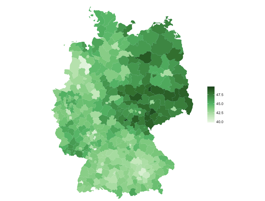
Of course, our analyzed example data isn’t a data story treasure. The old eastern Germany might be a story, one of our arranged lists might be, too. Or the results just gave you a hint where to dig deeper. Whatever conclusions you draw from your brief data analysis with R: It was brief! With the few R methods we’ve shown you today, it won’t take you much time to be able to draw the first important conclusions from any given data.
As always, you’ll find the entire code for this example on our GitHub page. If you have any questions, suggestions or feedback, feel free to leave a comment!