Adding tooltips to SVG graphics
Data Visualization tools offer cool ways to visualize data, but sometimes, you may want an even more customizable way of presenting a topic on the web. Maybe you already have the perfect graphic, but it’s not interactive yet. In this tutorial, we’ll show you a way to add tooltips to your SVG graphics.

One example for an interactive graphic a library can’t give you is the following site plan showing the Düsseldorfer Rhine Funfair with its attractions and food stands I built for the Rheinische Post. You can find additional information (in german) as tooltips when hovering over some of the attractions.
The basis for the map is a simple image I created with the design program Sketch. The trick I used to add tooltips to some of the map elements doesn’t require much coding and can be used to add tooltips to every website element including divs, text and pictures.
So let’s get right to it!
In this tutorial we will add tooltips to a very simple examplary SVG file you can download here. SVG stands for scaleable vector graphic. It’s the name of a file format where every image object is described not by the colour of its individual pixels, but by its basic shapes and their attributes. A big advantage SVG graphics have over other formats like PNG or JPEG ist that they’re scalable, just like their name says, so they never get blurry, no matter how much you zoom in. One way to create SVG files is to use a design program like Illustrator, Inkscape or Sketch.
Pro tip: RStudio lets you export charts in this format, too. Pimp up boring charts with some creative elements like I did with this stacked barchart on germanys reasons for trading trash:
The following screenshot shows the SVG image we are going to add tooltips to. It contains a big rectangle with a turquoise frame as the background, a red circle, a yellow star and a blue triangle.

If you save the image as an SVG file and open it with a text editor, this is what you’ll get:
<?xml version="1.0" encoding="UTF-8" standalone="no"?>
<svg width="768px" height="447px" viewBox="0 0 768 447" version="1.1" xmlns="http://www.w3.org/2000/svg" xmlns:xlink="http://www.w3.org/1999/xlink">
    <!-- Generator: Sketch 3.8.3 (29802) - http://www.bohemiancoding.com/sketch -->
    <defs>
        <rect id="path-1" x="0" y="0" width="768" height="447"></rect>
        <mask id="mask-2" maskContentUnits="userSpaceOnUse" maskUnits="objectBoundingBox" x="0" y="0" width="768" height="447" fill="white">
            <use xlink:href="#path-1"></use>
        </mask>
    </defs>
    <g id="journocode" stroke="none" stroke-width="1" fill="none" fill-rule="evenodd">
        <g id="example">
            <use id="Rectangle-1" stroke="#50E3C2" mask="url(#mask-2)" stroke-width="42" fill="#4A4A4A" xlink:href="#path-1"></use>
            <circle id="Oval-1" fill="#FF7979" cx="142.5" cy="147.5" r="92.5"></circle>
            <polygon id="Star-1" fill="#FFF681" points="384 349 328.748186 378.047597 339.300344 316.523799 294.600687 272.952403 356.374093 263.976201 384 208 411.625907 263.976201 473.399313 272.952403 428.699656 316.523799 439.251814 378.047597"></polygon>
            <polygon id="Triangle-1" fill="#A9FFEC" points="619 72 717 223 521 223"></polygon>
        </g>
    </g>
</svg>
This is not the typical way you expect images to look like. And this is what makes SVG awesome: It translates your artwork into a snippet of XML code. XML files, or Extensible Markup Language files, look a lot like HTML. They’re not, though: XML was developed as a way to store data, while HTML is responsible for displaying data, mostly on the web. XML doesn’t have predefined tags like <a> or <body>, like HTML does. In XML, you’re entirely free to make up your own tags to describe different parts of your data.
| Want to know more about HTML? Check out this tutorial by Kira Schacht |
SVG graphics still follow a very specific XML structure. That structure will work like a charm. Try putting the SVG code into your websites body. Set the SVG width to a 100%, delete the height settings and save the file as index.html. It should look like this:
<html>
<head>
</head>

<body>
<?xml version="1.0" encoding="UTF-8" standalone="no"?>
<svg width="100%" viewBox="0 0 768 447" version="1.1" xmlns="http://www.w3.org/2000/svg" xmlns:xlink="http://www.w3.org/1999/xlink">
    <!-- Generator: Sketch 3.8.3 (29802) - http://www.bohemiancoding.com/sketch -->
    <defs>
        <rect id="path-1" x="0" y="0" width="768" height="447"></rect>
        <mask id="mask-2" maskContentUnits="userSpaceOnUse" maskUnits="objectBoundingBox" x="0" y="0" width="768" height="447" fill="white">
            <use xlink:href="#path-1"></use>
        </mask>
    </defs>
    <g id="journocode" stroke="none" stroke-width="1" fill="none" fill-rule="evenodd">
        <g id="example">
            <use id="Rectangle-1" stroke="#50E3C2" mask="url(#mask-2)" stroke-width="42" fill="#4A4A4A" xlink:href="#path-1"></use>
            <circle id="Oval-1" fill="#FF7979" cx="142.5" cy="147.5" r="92.5"></circle>
            <polygon id="Star-1" fill="#FFF681" points="384 349 328.748186 378.047597 339.300344 316.523799 294.600687 272.952403 356.374093 263.976201 384 208 411.625907 263.976201 473.399313 272.952403 428.699656 316.523799 439.251814 378.047597"></polygon>
            <polygon id="Triangle-1" fill="#A9FFEC" points="619 72 717 223 521 223"></polygon>
        </g>
    </g>
</svg>
</body>
</html>
Adding interactivness
Great! Now, we will use the jQuery Plugin Tooltipster to add information to this svg! The Plugin has nice presettings and a really good documentation. These three steps will lead you to your first interactive SVG:
Step 1: Download the Plugin
Create a new folder, name it svg_interactive (for example) and store the index.html file in it.

You can find and download the Plugin’s scripts and style sheets on our GitHub repository or on the Plugins webpage. The main folder contains plenty of subfolders and documents you’ll barely need. For our example, we’ll only use tooltipster.bundle.min.js, tooltipster.bundle.min.css and, for a little bit of extra style, the theme sheet tooltipster-sideTip-punk.min.css. You can either save the whole tooltipster folder in svg_interactive and then set the correct paths to those files in your html head, or you only store the three files you’ll actually use in your folder like we did as shown in the screenshot.
Step 2: Include the scripts
Set the paths to the style sheets and the JS script in the head of your webpage. Don’t forget to include jQuery, since Tooltipster depends on it:
<html>
<head>
  <link rel="stylesheet" type="text/css" href="tooltipster.bundle.min.css"/>
  <link rel="stylesheet" type="text/css" href="tooltipster-sideTip-punk.min.css"/>
  <script type="text/javascript" src="http://code.jquery.com/jquery-1.10.0.min.js"></script>
  <script type="text/javascript" src="tooltipster.bundle.min.js"></script>

</head>

<body>
<?xml version="1.0" encoding="UTF-8" standalone="no"?>
<svg width="100%" viewBox="0 0 768 447" version="1.1" xmlns="http://www.w3.org/2000/svg" xmlns:xlink="http://www.w3.org/1999/xlink">
    <!-- Generator: Sketch 3.8.3 (29802) - http://www.bohemiancoding.com/sketch -->
    <defs>
        <rect id="path-1" x="0" y="0" width="768" height="447"></rect>
        <mask id="mask-2" maskContentUnits="userSpaceOnUse" maskUnits="objectBoundingBox" x="0" y="0" width="768" height="447" fill="white">
            <use xlink:href="#path-1"></use>
        </mask>
    </defs>
    <g id="journocode" stroke="none" stroke-width="1" fill="none" fill-rule="evenodd">
        <g id="example">
            <use id="Rectangle-1" stroke="#50E3C2" mask="url(#mask-2)" stroke-width="42" fill="#4A4A4A" xlink:href="#path-1"></use>
            <circle id="Oval-1" fill="#FF7979" cx="142.5" cy="147.5" r="92.5"></circle>
            <polygon id="Star-1" fill="#FFF681" points="384 349 328.748186 378.047597 339.300344 316.523799 294.600687 272.952403 356.374093 263.976201 384 208 411.625907 263.976201 473.399313 272.952403 428.699656 316.523799 439.251814 378.047597"></polygon>
            <polygon id="Triangle-1" fill="#A9FFEC" points="619 72 717 223 521 223"></polygon>
        </g>
    </g>
</svg>
</body>
</html>
Step 3: Add information to the image elements
Next, we’ll add a small snippet of Java Script code to the head manually. You could also save these few lines in an extra .js file and include them like the others, but for now, we’ll just keep it as an inline script.
  <script>
    $(document).ready(function() {
        $('.tooltip').tooltipster({
        theme: 'tooltipster-punk',
        contentAsHTML: true
        });
    });
</script>
This snippet defines a tooltip class with the theme tooltipster-punk and specifies that the content will be HTML. If you add
class="tooltip" title="Text <strong>Text</strong>"to an SVG element it will get a tooltipster-punk themed tooltip with HTML styled text. And that’s basically it!
For example, try:
<html>
<head>
  <link rel="stylesheet" type="text/css" href="tooltipster.bundle.min.css"/>
  <link rel="stylesheet" type="text/css" href="tooltipster-sideTip-punk.min.css"/>
  <script type="text/javascript" src="http://code.jquery.com/jquery-1.10.0.min.js"></script>
  <script type="text/javascript" src="tooltipster.bundle.min.js"></script>

  <script>
    $(document).ready(function() {
        $('.tooltip').tooltipster({
        theme: 'tooltipster-punk',
        contentAsHTML: true
        });
    });
</script>

</head>

<body>
<?xml version="1.0" encoding="UTF-8" standalone="no"?>
<svg width="100%" viewBox="0 0 768 447" version="1.1" xmlns="http://www.w3.org/2000/svg" xmlns:xlink="http://www.w3.org/1999/xlink">
    <!-- Generator: Sketch 3.8.3 (29802) - http://www.bohemiancoding.com/sketch -->
    <defs>
        <rect id="path-1" x="0" y="0" width="768" height="447"></rect>
        <mask id="mask-2" maskContentUnits="userSpaceOnUse" maskUnits="objectBoundingBox" x="0" y="0" width="768" height="447" fill="white">
            <use xlink:href="#path-1"></use>
        </mask>
    </defs>
    <g id="journocode" stroke="none" stroke-width="1" fill="none" fill-rule="evenodd">
        <g id="example">
            <use id="Rectangle-1" stroke="#50E3C2" mask="url(#mask-2)" stroke-width="42" fill="#4A4A4A" xlink:href="#path-1"></use>

<!-- add class and title here! -->
            <circle id="Oval-1" fill="#FF7979" cx="142.5" cy="147.5" r="92.5" class="tooltip" title="I am a circle!"></circle>
            <polygon id="Star-1" fill="#FFF681" points="384 349 328.748186 378.047597 339.300344 316.523799 294.600687 272.952403 356.374093 263.976201 384 208 411.625907 263.976201 473.399313 272.952403 428.699656 316.523799 439.251814 378.047597" class="tooltip" title="<strong>Stars for the win</strong><br>I am a star!"></polygon>
            <polygon id="Triangle-1" fill="#A9FFEC" points="619 72 717 223 521 223" class="tooltip" title="<p style='color:#F85D00'>Hell yeah!</p>"></polygon>
        </g>
    </g>
</svg>
</body>
</html>
Now, if you want to change the tooltip’s style you can save some CSS settings in a new stylesheet and include it in the webpages head. You can change the font family, the color of the popup background, the popup arrow or the default pink border-bottom, for example, like this:
.tooltipster-sidetip.tooltipster-punk
.tooltipster-box{
 border-bottom:3px solid #50E3C2; /*colored line at popup bottom*/
 background:#fff /*background of popup*/
 }

/*arrow and border color depending on where the tooltip opens (for example above or below the element)*/
.tooltipster-sidetip.tooltipster-punk.tooltipster-top
.tooltipster-arrow-border{border-top-color:#50E3C2}

.tooltipster-sidetip.tooltipster-punk.tooltipster-bottom
.tooltipster-arrow-border{border-bottom-color:#fff}

.tooltipster-sidetip.tooltipster-punk.tooltipster-left
.tooltipster-arrow-border{border-left-color:#fff}

.tooltipster-sidetip.tooltipster-punk.tooltipster-right
.tooltipster-arrow-border{border-right-color:#fff}

.tooltipster-sidetip.tooltipster-punk
.tooltipster-content{color:#000;padding:8px 16px; font-family:'Arial';}
Save the file as style.css and include it in the .html file. You can also change the trigger for opening and closing the tooltips in the manually added Java Script. You can set it to hover, click or optimize it for mobile devices with a customized trigger like this:
<html>
<head>
<link rel="stylesheet" type="text/css" href="tooltipster.bundle.min.css"/>
<link rel="stylesheet" type="text/css" href="tooltipster-sideTip-punk.min.css"/>
<link rel="stylesheet" type="text/css" href="style.css"/>
<script type="text/javascript" src="http://code.jquery.com/jquery-1.10.0.min.js"></script>
<script type="text/javascript" src="tooltipster.bundle.min.js"></script>
<script>
$(document).ready(function() {
$('.tooltip').tooltipster({
theme: 'tooltipster-punk',
'maxWidth': 270, // set max width of tooltip box
contentAsHTML: true, // set title content to html
trigger: 'custom', // add custom trigger
triggerOpen: { // open tooltip when element is clicked, tapped (mobile) or hovered
click: true,
tap: true,
mouseenter: true
},
triggerClose: { // close tooltip when element is clicked again, tapped or when the mouse leaves it
click: true,
scroll: false, // ensuring that scrolling mobile is not tapping!
tap: true,
mouseleave: true
}
});
});
</script>
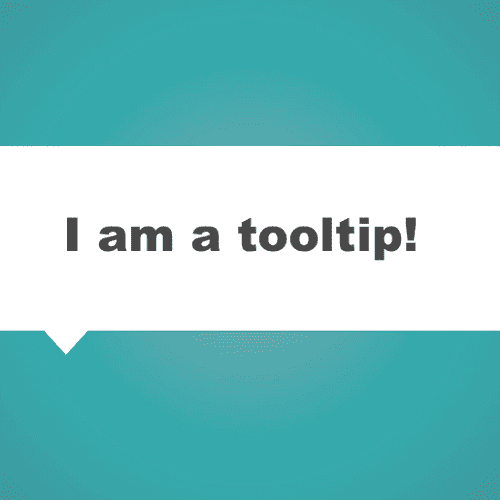
</head>And this is the result: Click on it, hover over the symbols or try it on your smartphone!
So be creative with your data visualizations, even if complex Java Script libraries aren’t yours. As always, you can get the entire code to this example on our Github Page. If you have any questions or feedback, feel free to leave a comment or mail us!